Solar Energy Comparison Charts: Key Metrics, Data Sources & How to Read Them

Global solar PV added well over 300 GW of new capacity in 2023—another record year according to the IEA and IRENA. As deployments scale, the need for clear, apples-to-apples solar energy comparison charts has never been greater. Whether you’re choosing between monocrystalline and thin‑film modules or evaluating rooftop versus utility‑scale economics, the most useful charts standardize definitions, disclose data sources, and visualize uncertainty alongside performance.
Below, we outline what to compare, how to normalize it, and which visual formats turn complex datasets into decisions.
By the numbers: the metrics most charts should show
- Module efficiency (commercial ranges, 2024):
- Mono PERC/TOPCon/HJT: ~20–23% module efficiency (Fraunhofer ISE, manufacturer datasheets)
- Polycrystalline: ~17–19% (declining market share)
- CdTe thin‑film: ~19–21% (First Solar series modules; public filings/datasheets)
- Degradation rate: median ~0.5%/year across technologies; modern modules commonly 0.2–0.5%/year (NREL degradation meta-analyses)
- Temperature coefficient of power (per °C above 25°C):
- Crystalline silicon: −0.35% to −0.45%/°C (typical −0.38%/°C)
- CdTe thin‑film: ~−0.25% to −0.29%/°C
- Typical warranty/life: 25–30 years performance warranty; operational lifetimes 25–35+ years
- Footprint:
- Rooftop: ~5–6 m² per kWdc (depending on module efficiency/spacing)
- Utility‑scale ground mount: ~5–10 acres per MWac (NREL land-use benchmarks)
- Upfront costs (U.S., pre‑incentive, 2024 order of magnitude):
- Residential rooftop: ~$2.5–$4.0/Wdc (LBNL “Tracking the Sun,” NREL cost benchmarks)
- Commercial rooftop: ~$1.7–$2.5/Wdc
- Utility‑scale PV: ~$0.9–$1.4/Wdc
- LCOE (unsubsidized ranges, resource/cost dependent):
- Utility‑scale PV: ~$25–$60/MWh typical; higher in low‑insolation/high‑cost contexts (Lazard, NREL ATB)
- Rooftop: location/retail‑rate dependent; often ~$80–$200/MWh equivalent
- O&M (utility‑scale PV): ~$10–$20/kW‑yr or ~$6–$12/MWh (NREL ATB; industry surveys)
- Capacity factor:
- Fixed‑tilt U.S.: ~15–22%; single‑axis tracking: ~20–30% in high‑insolation sites (EIA, NREL)
- Lifecycle GHG emissions: typically ~20–50 gCO2e/kWh for modern PV (IEA, IPCC AR6)
- Energy payback time: ~1–3 years depending on insolation and technology (IEA PVPS; peer‑reviewed LCA)
1) Comparing solar technologies and system types: which metrics matter most
Core technology classes
- Monocrystalline (PERC, TOPCon, HJT): Highest market share; leading module efficiency and strong temperature performance for c‑Si. Bifacial variants add rear‑side production, boosting energy yield by ~5–15% depending on albedo and array geometry (NREL field studies).
- Polycrystalline: Lower efficiency, largely supplanted by mono in new builds.
- Thin‑film (CdTe, CIGS): Competitive efficiency for CdTe, with superior temperature coefficient and shading tolerance compared to c‑Si. Market share concentrated among a few manufacturers.
System types
- Rooftop: Space‑constrained, zero additional land footprint, close to load (reduced transmission). Design must manage shading, roof age/orientation, and safety setbacks.
- Utility‑scale (fixed‑tilt or tracking): Economies of scale and lower installed cost per watt. Tracking often adds ~10–25% energy yield over fixed‑tilt, improving capacity factor but with higher CapEx and O&M.
What to chart
- Efficiency versus temperature coefficient: A scatter plot with module efficiency on the x‑axis and temperature coefficient on the y‑axis (more negative is worse). Color by technology (mono, thin‑film). This shows why thin‑film can outperform in hot climates despite lower or similar nameplate efficiency.
- Degradation distributions: Violin or box plots by technology/generation (e.g., PERC vs TOPCon vs CdTe) using median and interquartile ranges from NREL’s multi‑year datasets. Include whiskers for 5th–95th percentiles.
- Footprint per kW or MW: Bars showing m²/kWdc for rooftop and acres/MWac for utility‑scale, annotated with assumptions (row spacing, tilt, DC/AC ratio).
Definitions to include in the chart legend:
- Temperature coefficient: Percent output change per °C rise above 25°C module temperature.
- Degradation rate: Average annual decline in output after year 1.
- DC/AC ratio (inverter loading): PV array DC capacity divided by inverter AC rating (common utility‑scale values: 1.2–1.5). Influences clipping and capacity factor.
2) Economics: cost, LCOE, payback, and O&M across contexts
Upfront cost ($/kW) and how to normalize it
- Use $/Wdc for modules and arrays; use $/Wac when comparing plant‑level costs that influence grid interconnections and capacity markets.
- Benchmark datasets: NREL cost benchmark reports, LBNL “Tracking the Sun” (installed prices, U.S. residential/commercial), SEIA/Wood Mackenzie for market trends.
Recommended charts:
- Installed cost distributions by market segment (residential, commercial, utility‑scale) with interquartile ranges. Include markers for median values and annotate whether costs are before or after incentives.
- Cost versus scale scatter: Each point an individual project with system size on x‑axis and $/W on y‑axis; fit a learning‑rate/experience curve where possible.
LCOE and payback period
- LCOE: the present value of lifetime costs divided by lifetime energy. Critical inputs: CapEx, O&M, performance (capacity factor), degradation, discount rate, system life.
- Typical ranges (unsubsidized): utility‑scale PV ~$25–$60/MWh in high‑insolation, low‑cost markets; higher in low‑sun or high‑CapEx contexts (Lazard, NREL ATB). Rooftop LCOE compares to retail rates and often pencils at ~$80–$200/MWh, depending on location and financing.
- Payback period: widely variable with retail electricity prices and incentives; many U.S. residential markets see ~5–12 years. Commercial C&I projects frequently target 4–8 years with favorable tariffs.
Recommended charts:
- Stacked bars of LCOE components (CapEx, fixed/variable O&M, financing, degradation impact) by market segment and technology.
- Box plots of simple payback by state/region (include net metering vs. net billing assumptions), disclosing retail rate and incentive inputs.
Incentives, financing, and O&M
- Incentives: U.S. Investment Tax Credit at 30% (with adders for domestic content, low‑income, energy communities) can reduce LCOE materially. Feed‑in tariffs or contracts-for-difference in other regions shift revenue certainty and finance costs (IEA policy databases).
- Financing: Weighted average cost of capital (WACC) is a dominant LCOE driver. Show tornado diagrams to illustrate sensitivity to WACC ±2%, CapEx ±15%, and capacity factor ±3–5 percentage points.
- O&M: Utility‑scale PV O&M commonly ~$10–$20/kW‑yr, trending downward with better analytics and bifacial/tracking optimization (NREL ATB; industry data). Include separate bars for vegetation management, cleaning, site security, and inverter replacements.
Where relevant, link out for deeper buying context:
- For homeowners evaluating costs and system choices, see Solar Panel Installation Cost: 2026 Pricing, Breakdown & Savings Guide (/renewable-energy/solar-panel-installation-cost-2026-pricing-breakdown-savings)
- Choosing modules? See Best Solar Panels for Home 2026: Top Picks, Cost & Buying Guide (/renewable-energy/best-solar-panels-for-home-2026-top-picks-cost-buying-guide)
3) Performance by geography and climate: capacity factor, seasonality, and soiling
Capacity factor and irradiance
- Capacity factor is the percentage of time a system would need to operate at rated output to match its actual annual energy. It wraps hours of sun, weather, tracking, and system losses into one comparable number.
- U.S. utility‑scale PV: fixed‑tilt ~15–22%; single‑axis tracking ~20–30% in high‑resource regions like the U.S. Southwest (EIA 923/860; NREL ATB). Europe typically skews lower due to latitude and clouds; desert sites globally can exceed 28% with tracking.

Davis Instruments Wireless Vantage Pro2 Plus with UV & Solar Radiation Sensors and WeatherLink Console - Metric : Patio, Lawn & Garden
View on AmazonRecommended charts:
- Heatmap of capacity factor by region: grid each state/country cell with median CF for fixed‑tilt and tracking. Provide tooltips displaying irradiance (kWh/m²/yr), albedo assumptions, and DC/AC ratio.
Seasonal and hourly profiles
- Shape matters for grid value. Plot normalized monthly output and 24‑hour profiles for at least three climates (e.g., Phoenix, Boston, Seattle). This highlights winter dips at higher latitudes and the midday peak that aligns with commercial load.
- Example PVWatts‑style annual yields for a 6 kWdc south‑facing rooftop at 25° tilt, no shade (illustrative, round‑number values consistent with NREL PVWatts ranges):
- Phoenix, AZ: ~9,500–10,500 kWh/yr
- Boston, MA: ~7,000–8,000 kWh/yr
- Seattle, WA: ~6,000–7,000 kWh/yr Include error bars for weather variability and note that azimuth, tilt, shading, and system losses can shift results ±10–20%.
Shading, soiling, and temperature effects
- Shading: Mismatch losses can be nonlinear; even small obstructions can cut string output. Bypass diodes and module‑level power electronics mitigate impacts. Visualize with a sensitivity chart showing percent energy lost versus shaded area at different times of day.
- Soiling: Dust/pollen losses range from <1% in rainy climates to >10% in arid, agricultural, or industrial zones if uncleaned (IEA PVPS Task 13). Plot a bar chart by site type with cleaning intervals.
- Temperature: Higher module temperature reduces power; plot expected power versus ambient temperature using technology‑specific coefficients and a simple thermal model (NOCT). Thin‑film’s advantage emerges in hot sites.
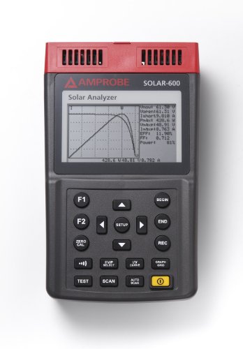
Amprobe SOLAR-600 Solar Power Analyzer: Industrial Power Meters: Amazon.com
View on AmazonFor a practical walkthrough of system sizing and production modeling, see How to Calculate Solar Panel Needs: Step-by-Step Guide & Examples (/renewable-energy/how-to-calculate-solar-panel-needs).
4) Environmental and lifecycle factors: beyond kilowatt‑hours
Embodied carbon, energy payback, and recyclability
- Embodied carbon: Most modern PV falls around ~20–50 gCO2e/kWh across its lifecycle, with manufacturing electricity mix and module type as key drivers (IEA, IPCC AR6). Show a distribution by manufacturing region (cleaner grids reduce embodied carbon).
- Energy payback time (EPBT): ~1–3 years depending on irradiance and technology (IEA PVPS LCAs). Map EPBT as a function of global horizontal irradiance to show why hot, sunny regions accelerate net‑zero benefits.
- Recyclability: Glass and aluminum constitute the majority of module mass and are highly recyclable; polymers and silver remain challenging. EU WEEE regulations mandate PV recycling; the U.S. is adding state‑level programs. Use a stacked mass chart for module bill of materials and a second stack for current recycling recovery rates.
Materials and resource constraints
- Silicon: Polysilicon supply expanded sharply in 2022–2024, easing prices; silver use is a watchpoint as cell metallization seeks to thrift and substitute with copper and new pastes (IEA PVPS, industry roadmaps). Visualize silver intensity (mg/W) trend lines over time.
- CdTe thin‑film: Tellurium availability is constrained as a byproduct; manufacturers pursue closed‑loop recycling and thinner absorber layers. Include a risk matrix chart scoring supply concentration and substitutability.
Land use and biodiversity
- Utility‑scale PV typically occupies ~5–10 acres/MWac, varying with topography, setbacks, and DC/AC ratio (NREL land‑use studies). Charts comparing land‑use intensity should annotate whether the footprint is fenced area or disturbed ground.
- Dual‑use options—agrivoltaics (crops/grazing under arrays) and pollinator‑friendly plantings—can reduce habitat tradeoffs. A side‑by‑side chart can quantify co‑benefits (e.g., reduced mowing O&M, soil moisture retention) and any yield penalties.
For a broader primer on technology, costs, and climate benefits, explore The Complete Guide to Solar Energy: How It Works, Costs, and Benefits (/renewable-energy/complete-guide-solar-energy-how-it-works-costs-benefits).
5) Building solar energy comparison charts: data sources, normalization, and design
This is where many misleading charts go wrong. To get trustworthy, decision‑grade visuals, anchor on transparent datasets and consistent methods.
Recommended datasets and tools
- Performance and resource
- NREL PVWatts and System Advisor Model (SAM) for site‑specific production.
- NREL National Solar Radiation Database (NSRDB) and Europe’s PVGIS for irradiance.
- EIA 923/860 for U.S. plant‑level generation and capacity factors.
- Costs and LCOE
- NREL Annual Technology Baseline (ATB) and cost benchmarks.
- Lazard Levelized Cost of Energy analysis for cross‑technology LCOE.
- LBNL “Tracking the Sun” for U.S. installed prices and trends; SEIA/Wood Mackenzie for market data.
- Technology characteristics
- Manufacturer datasheets (IEC 61215/61730 certified) for efficiency, temperature coefficients, and warranties.
- Fraunhofer ISE Photovoltaics Report and IEA PVPS “Trends in PV Applications.”
- Lifecycle and environment
- IEA PVPS Task reports and IPCC/peer‑reviewed LCAs for embodied carbon and EPBT.
- NREL land‑use benchmarks and U.S. agency environmental guidance for siting.

Handbook of Photovoltaic Science and Engineering: Luque, Antonio, Hegedus, Steven
by Antonio Luque (Editor), Steven Hegedus (Editor) See all formats and editions · Handbook of Photovoltaic Science and Engineering <strong>incorporates the most recent technological advances and resea
Check Price on AmazonNormalization choices to disclose
- Capacity ratings: DC (module nameplate at STC) vs AC (inverter interconnection). When comparing LCOE or land use, AC is typically the better denominator. For module comparisons, use DC.
- Test conditions: STC vs NOCT/POA (plane‑of‑array) irradiance. Use consistent irradiance/temperature assumptions or convert using temperature coefficients and spectral models if mixing sources.
- Loss assumptions: Clearly quantify soiling, shading, clipping, wiring, mismatch, and availability losses. A standard PVWatts loss stack (~14% total) is a reasonable reference but site‑specific data is better.
- Degradation: Include first‑year performance step (if any) and long‑term annual rates; specify whether LCOE includes degradation.
- Financial assumptions: Real vs nominal discount rates, tax treatment, incentives (e.g., ITC), escalation of O&M and power prices.
Visualization best practices for solar energy comparison charts
- Use medians and interquartile ranges as defaults; show outliers transparently.
- Annotate uncertainty bands for modeled outputs (e.g., P50/P90). Many stakeholders need P90 energy for financing.
- Separate fixed‑tilt and tracking rather than mixing them in the same CF distribution, or encode via color/shape.
- Use heatmaps for geospatial metrics (CF, EPBT, LCOE) with a perceptually uniform color scale. Provide an inset legend with the exact value range.
- For multi‑factor trade‑offs (e.g., efficiency vs cost vs temperature coefficient), use a bubble chart or parallel coordinates, but keep axes labeled with units and ranges.
- Keep denominators consistent across panels within a dashboard (e.g., all $/Wdc or all $/Wac), and state them in subtitles.
Actionable takeaways by audience
- Homeowners
- Efficiency affects roof area, but LCOE and reliability matter as much as nameplate. Run site‑specific modeling and shade analysis before picking modules.
- Payback depends on retail tariffs and incentives; prioritize reputable installers and equipment over chasing record efficiency.
- If backup or TOU arbitrage is important, consider pairing storage. See Home Solar Battery Storage: Complete Buyer’s Guide & Cost Calculator (/renewable-energy/home-solar-battery-storage-buyers-guide-cost-calculator) and Solar Panels for Beginners: A Practical, Data-Driven Guide (/renewable-energy/solar-panels-for-beginners-guide).
- Businesses (C&I) and utilities
- Model both energy and demand charge impacts; PV plus smart controls can reduce peak charges.
- In procurement, request temperature‑corrected yield estimates, P50/P90 cases, and clear O&M scopes.
- For utility‑scale, evaluate bifacial/tracking gains against site albedo, row spacing, and O&M complexity.
- Policymakers and planners
- Publish standardized interconnection and permitting data to reduce soft costs.
- Encourage dual‑use siting (agrivoltaics, rooftops, parking canopies) to minimize land conflicts.
- Use transparent LCOE/LCUE (levelized cost of avoided emissions) comparisons with explicit WACC and grid value assumptions.
What’s next: adding time, value, and grid context to charts
Two charting evolutions will improve decisions in the next wave of deployments:
- Value‑based metrics: Overlay avoided‑cost or locational marginal price (LMP) curves on hourly PV output profiles to show when energy is most valuable. For distributed PV, include demand charge and TOU impacts.
- Lifecycle and circularity: Add repairability indices, warranty claim rates, and recycling recovery factors alongside efficiency and cost. As silver thrifting and new cell architectures (TOPCon, HJT, tandem/perovskite hybrids) mature, track mg/W material intensity and warranty-backed degradation rates to quantify real‑world bankability.
The bottom line: the best solar energy comparison charts are explicit about assumptions, show distributions rather than single points, and present performance, cost, and environmental metrics side by side. With transparent data and thoughtful visualization, homeowners can pick better systems, developers can optimize designs, and policymakers can steer incentives where they deliver the most reliable, low‑carbon kilowatt‑hours.
Recommended Products
Handbook of Photovoltaic Science and Engineering: Luque, Antonio, Hegedus, Steven
by Antonio Luque (Editor), Steven Hegedus (Editor) See all formats and editions · Handbook of Photovoltaic Science and Engineering <strong>incorporates the most recent technological advances and resea
Amprobe SOLAR-600 Solar Power Analyzer: Industrial Power Meters: Amazon.com
The Amprobe solar power analyzer <strong>evaluates the energy output, efficiency, and placement of solar panels</strong>, helps determine the proper inverter size in solar power systems, and identifie
Davis Instruments Wireless Vantage Pro2 Plus with UV & Solar Radiation Sensors and WeatherLink Console - Metric : Patio, Lawn & Garden
<strong>Sensor suite includes outside temperature and humidity sensors in passive radiation shield, wind speed and direction; rainfall; and UV and Solar radiation</strong>. Mount anemometer up to 12 m